


 Favorites
 My Account
 My Account
 High Contrast
 Ideas
IdeasFive Home Color Palettes to Try Today
In art class as children, we learn all about colors — primary colors, complementary colors and colors NOT to mix together unless we want a nasty shade of brown. Now that you’ve got your colors down, you probably know your favorite shade of blue and that you definitely don’t care for fuchsia. But creating home color palettes can be a lot less clear-cut.
Fortunately, you don’t need a degree in art or interior design to create beautiful home color palettes. All you need to do is look to your favorite photo or piece of art, or an eye-catching fabric or print, for color inspiration. If the colors within these pieces complement one another, go for it.
Not sure where to start? To get you thinking, we put together five home color palettes based on the latest color trends.
Going bold for beginners
Blues, grays and greens are some of the most popular colors in home décor right now. These colors are thought to be calming or soothing and can be great options for any room. Blue is elegant, sophisticated and classic, and it coordinates well with yellows and purples. It’s a popular choice for kitchens, bathrooms and bedrooms. Far from depressing, gray is “the new neutral.”
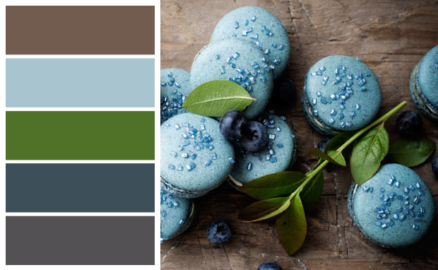 Filled with many of the new neutrals, this is the perfect palette for those experimenting with color for the first time.
In the living room, blue- and green-hued throw pillows add a touch of color to a gray couch. These colors pair well with metallic, too, for rich, jewel-toned décor. Use deep navy paint to accent one wall in the kitchen and offset it with a gray dinette table.
Cool and modern
Many of today’s color palettes reflect a Mid-century Modern feel. Clean lines and modern takes on classic greens and grays can put a fresh spin on any room. A charcoal sofa and coffee table framed by a pale gray wall make the perfect canvas for the bright pop of a celery-colored floor lamp and accent piece, such as a vase.
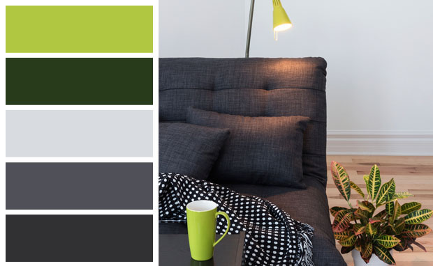 Less is more when you pair different hues of gray with a variety of greens.
Greens can be serene, stable and signify cool composure. Try shades of green (from chartreuse or emerald to avocado or mossy green) in the home office. It might even help ensure your organized office stays that way.
Think pink
Gender bias, be gone! Pinks can evoke a sense of romance, and, when paired with other soft pastels such as warm peaches and minty greens, pink can have a tranquil and gentle effect. If gender roles haven’t quite loosened in your household and you need some ammunition to get your guy convinced to try pink in your home décor, check out this story about an exhibit at the Boston Museum of Fine Arts. Historically, pink was a stronger, passionate color, probably because it derives from red. From the 1700s to World War II, both men and women wore pink, with blue thought of as a dainty color. How times change!
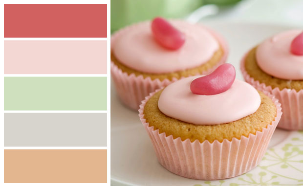 Some experts predict pink soon will become green’s best companion color.
If you are bold enough to try it, pink and light pastels work great alongside neutral colors. In the bedroom, temper the femininity of silky pink walls with minty green or icy blue linens and accent pillows, or with neutral night stands and dressers.
Bring the outdoors in
If you love the outdoors but are restricted by apartment walls or the concrete jungle, bring the beauty of nature to you with an earthy color palette.
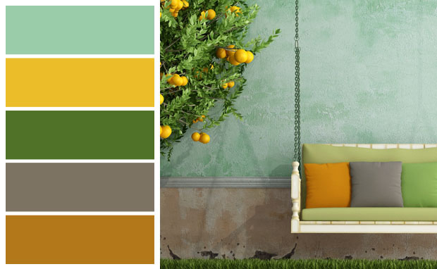 Create a feeling of warmth and connectedness in your home by introducing earthy colors.
For inspiration with this palette, look to the deep shades of foliage and succulents and the sunny, bright colors of petals, sunshine and fruit. While earthy tones will work as a mood-booster in any room, the added benefit of natural light — southern exposure, anyone?! — will help you become one with nature (minus the bugs, of course). To invite in even more nature, display your collection of shells or driftwood from a recent beach vacation, floral fabrics or artwork, or textures such as rattan or distressed wood. Don’t forget to bring nature in via a houseplant or small cactus.
Exotic naturals
Looking to welcome the outdoors in a not-so-subtle way? This vibrant palette packs a punch with brilliant pinks, deep greens and bright blues that evoke a sense of fresh summer flowers, open fields and blue skies.
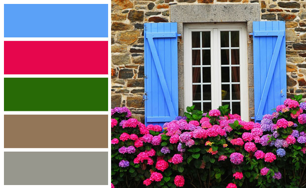 Bring a tropical or exotic look to your home with accents such as exotic fuchsia, brilliant blue and deep green.
Try this palette in the office or craft room to spark inspiration and creative thinking. If the exotic appeal of these colors cause anxiety, try it in small doses with a neutral gray, green and blue base accented with a pink ottoman, flower pot or lamp. Tie this palette to the outdoors by using it in the sunroom or solarium. The natural hues inside will blend into the outside scenery behind you — creating one bright, vibrant space.
Where does your home’s color inspiration come from? Do you think pink, or are you simply modern? Let us know what home color palettes draw you in.
Fortunately, you don’t need a degree in art or interior design to create beautiful home color palettes. All you need to do is look to your favorite photo or piece of art, or an eye-catching fabric or print, for color inspiration. If the colors within these pieces complement one another, go for it.
Not sure where to start? To get you thinking, we put together five home color palettes based on the latest color trends.
Going bold for beginners
Blues, grays and greens are some of the most popular colors in home décor right now. These colors are thought to be calming or soothing and can be great options for any room. Blue is elegant, sophisticated and classic, and it coordinates well with yellows and purples. It’s a popular choice for kitchens, bathrooms and bedrooms. Far from depressing, gray is “the new neutral.”
Filled with many of the new neutrals, this is the perfect palette for those experimenting with color for the first time.In the living room, blue- and green-hued throw pillows add a touch of color to a gray couch. These colors pair well with metallic, too, for rich, jewel-toned décor. Use deep navy paint to accent one wall in the kitchen and offset it with a gray dinette table.
Cool and modern
Many of today’s color palettes reflect a Mid-century Modern feel. Clean lines and modern takes on classic greens and grays can put a fresh spin on any room. A charcoal sofa and coffee table framed by a pale gray wall make the perfect canvas for the bright pop of a celery-colored floor lamp and accent piece, such as a vase.
Less is more when you pair different hues of gray with a variety of greens.Greens can be serene, stable and signify cool composure. Try shades of green (from chartreuse or emerald to avocado or mossy green) in the home office. It might even help ensure your organized office stays that way.
Think pink
Gender bias, be gone! Pinks can evoke a sense of romance, and, when paired with other soft pastels such as warm peaches and minty greens, pink can have a tranquil and gentle effect. If gender roles haven’t quite loosened in your household and you need some ammunition to get your guy convinced to try pink in your home décor, check out this story about an exhibit at the Boston Museum of Fine Arts. Historically, pink was a stronger, passionate color, probably because it derives from red. From the 1700s to World War II, both men and women wore pink, with blue thought of as a dainty color. How times change!
Some experts predict pink soon will become green’s best companion color.If you are bold enough to try it, pink and light pastels work great alongside neutral colors. In the bedroom, temper the femininity of silky pink walls with minty green or icy blue linens and accent pillows, or with neutral night stands and dressers.
Bring the outdoors in
If you love the outdoors but are restricted by apartment walls or the concrete jungle, bring the beauty of nature to you with an earthy color palette.
Create a feeling of warmth and connectedness in your home by introducing earthy colors.For inspiration with this palette, look to the deep shades of foliage and succulents and the sunny, bright colors of petals, sunshine and fruit. While earthy tones will work as a mood-booster in any room, the added benefit of natural light — southern exposure, anyone?! — will help you become one with nature (minus the bugs, of course). To invite in even more nature, display your collection of shells or driftwood from a recent beach vacation, floral fabrics or artwork, or textures such as rattan or distressed wood. Don’t forget to bring nature in via a houseplant or small cactus.
Exotic naturals
Looking to welcome the outdoors in a not-so-subtle way? This vibrant palette packs a punch with brilliant pinks, deep greens and bright blues that evoke a sense of fresh summer flowers, open fields and blue skies.
Bring a tropical or exotic look to your home with accents such as exotic fuchsia, brilliant blue and deep green.Try this palette in the office or craft room to spark inspiration and creative thinking. If the exotic appeal of these colors cause anxiety, try it in small doses with a neutral gray, green and blue base accented with a pink ottoman, flower pot or lamp. Tie this palette to the outdoors by using it in the sunroom or solarium. The natural hues inside will blend into the outside scenery behind you — creating one bright, vibrant space.
Where does your home’s color inspiration come from? Do you think pink, or are you simply modern? Let us know what home color palettes draw you in.
Get Social


Favorites

